
Build maintainable React apps — Part 2


Photo by https://unsplash.com/photos/lQT_bOWtysE
Ease change: future-proof component code
Part II: Ease change, future-proof component code
- State management
- Loosely Coupled Component
- Components decomposition patterns
- Enable React warning and keep your dependencies up-to-date
React applications are always evolving with refactoring from:
- new features
- existing features evolution
- bug fixing
- dependencies updates
With that in mind, and far from wanting to predict the future,
we will see how to help your application embrace future changes by having some tips and best practice on:
we will see how to help your application embrace future changes by having some tips and best practice on:
- State management
- Loosely Coupled Component
- Components decomposition patterns
- Enable React warning and keep your dependencies up-to-date
1. State management
State management is often, at scale, the root of many performances and consistency issues in React apps.
This subject has already a lot of great articles from experts in the fields, let me share some:
This subject has already a lot of great articles from experts in the fields, let me share some:
If you start building an app
I would recommend looking at this tweet that sums the approach to maintainable state management:
For more information, the original article:
If you already have an existing app
Identifying your application parts will help you refining where the wrong
“state lift-up” has been done and refactoring it.
“state lift-up” has been done and refactoring it.
More generally, the following rule of thumb can be followed:
- keep state as local as possible by using useState()
- use React.Context to avoid prop-drilling
- use redux/mobx only for the application-level state (configuration, session)
2. Loosely Coupled Component
Since each line of code is meant to be changed, let’s try to make it easy to remove, update, or move.
Coupling is definitely the enemy of change, but what is “coupling”?
Coupling is definitely the enemy of change, but what is “coupling”?
In this section, we will take a look at examples of how data fetching and manipulation is a great source of coupling:
- i. The loss of the Container/View pattern?
- ii. Coupling at the data manipulation-level
We will see examples based on the following UI:
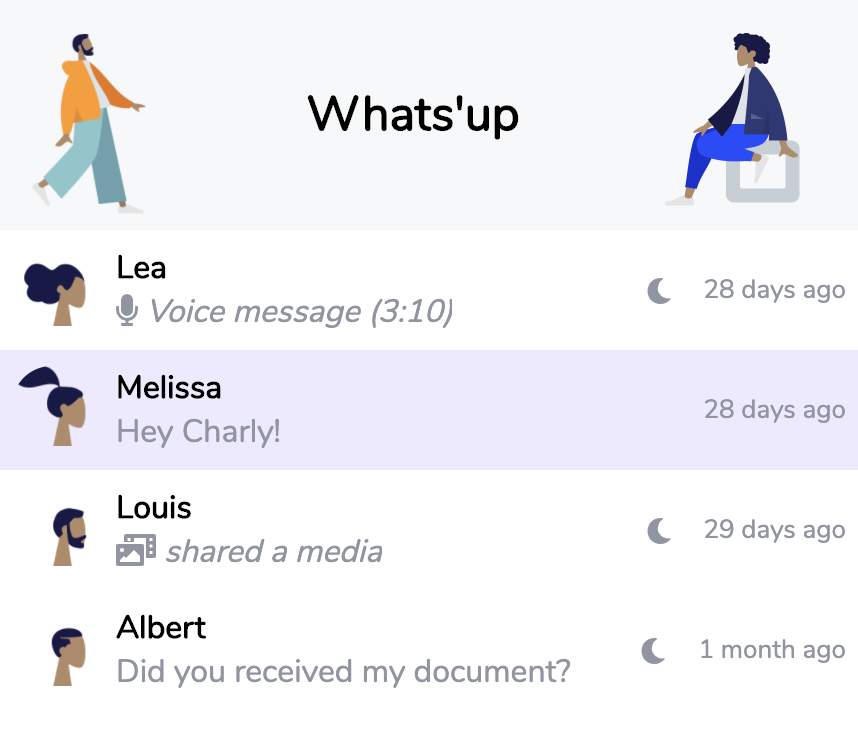
UI defined by <App /> ➡️ <Chat /> ️️➡️ <Conversation /> components
i. The loss of the Container/View pattern?
The rise of hooks marked the end of the HoC and Container/View patterns; however, does it mean that components should carry all the data fetching knowledge?
Let’s see an example of a <Chat /> component fetching data using Apollo GraphQL useQuery() hook:
1import * as React from "react";
2import gql from "graphql-tag";
3import { DateTime } from "luxon";
4import { useQuery } from "@apollo/react-hooks";
5import { sortBy } from "lodash";
6
7import "./style.css";
8
9const GET_CONVERSATIONS = gql`
10  query getConversations {
11    conversations {
12      id
13      user {
14        first_name
15        avatar_name
16        timezone
17      }
18      messages {
19        id
20        text
21        voice
22        media
23        date_time
24      }
25    }
26  }
27`;
28
29interface Conversation {
30  id: number;
31  user: {
32    first_name: string;
33    avatar_name: string;
34    timezone: string;
35  };
36  messages: Message[];
37}
38
39interface Message {
40  id: number;
41  text: string;
42  voice: boolean;
43  media: boolean;
44  date_time: string;
45}
46
47interface getConversations {
48  conversations: Conversation[];
49}
50
51const lastMessage = (conversation: Conversation): Message =>
52  conversation.messages[0];
53
54const Chat: React.SFC = () => {
55  const [runQuery, setRunQuery] = React.useState(false);
56  const { data } = useQuery<getConversations>(GET_CONVERSATIONS, {
57    skip: !runQuery
58  });
59
60  // ...
61};
62
63export default Chat;
Since our <Chat /> component is directly using useQuery(), it makes sense to also define the GraphQL query in the component file, also the related TypeScript data types, and include the conversations sorting logic in the component.
However, a component is meant to handle UI aspects like:
However, a component is meant to handle UI aspects like:
- Handle the display logic accordingly to the product design system definition
Handle loading UI states, UI business logic
- Handle UI interactions
ex: dynamic styling, derived state, error UI states
All the above component’s responsibilities already represent a lot of logic and complexity.
When it comes to data, a good modern solution to replace HoC or Container/View is custom hooks.
When it comes to data, a good modern solution to replace HoC or Container/View is custom hooks.
Our refactored version of <Chat /> component is relying on a useGetConversation() (getConversations.ts) custom hook that provides typed and sorted data.
getConversations.ts:
1import * as React from "react";
2import gql from "graphql-tag";
3import { useQuery } from "@apollo/react-hooks";
4import { DateTime } from "luxon";
5import { sortBy } from "lodash";
6
7const GET_CONVERSATIONS = gql`
8  query getConversations {
9    conversations {
10      id
11      user {
12        first_name
13        avatar_name
14        timezone
15      }
16      messages {
17        id
18        text
19        voice
20        media
21        date_time
22      }
23    }
24  }
25`;
26
27export interface User {
28  first_name: string;
29  avatar_name: string;
30  timezone: string;
31}
32
33export interface Conversation {
34  id: number;
35  user: User;
36  messages: Message[];
37}
38
39export interface Message {
40  id: number;
41  text: string;
42  voice: boolean;
43  media: boolean;
44  date_time: string;
45}
46
47export interface getConversations {
48  conversations: Conversation[];
49}
50
51export const isNew = (conversation: Conversation) => conversation.id === 1;
52export const isAudio = (message: any) => message.voice;
53export const isMedia = (message: any) => message.media;
54export const lastMessage = (conversation: Conversation): Message =>
55  conversation.messages[0];
56
57export const userTimes = (user: User) => [
58  Math.ceil(
59    parseInt(
60      DateTime.local()
61        .setZone(user.timezone)
62        .toFormat("HH"),
63      10
64    )
65  ),
66  DateTime.local().diff(
67    DateTime.local().setZone(user.timezone, {
68      keepLocalTime: true
69    }),
70    "hours"
71  ).hours
72];
73
74export const useGetConversations = (): Conversation[] | null => {
75  const [runQuery, setRunQuery] = React.useState(false);
76  const { data } = useQuery<getConversations>(GET_CONVERSATIONS, {
77    skip: !runQuery
78  });
79
80  // 💩hack to fake a loading...
81  React.useEffect(() => {
82    setTimeout(() => setRunQuery(true), 2000);
83  });
84
85  return data
86    ? sortBy(
87        data.conversations,
88        (c: Conversation) =>
89          -DateTime.fromISO(lastMessage(c).date_time).toMillis()
90      )
91    : null;
92};
Chat.tsx:
1import * as React from "react";
2import {
3  useGetConversations,
4  Conversation as tConversation
5} from "./getConversations";
6import Conversation from "./Conversation/index";
7
8import "./style.css";
9
10const Chat: React.SFC = () => {
11  const conversations = useGetConversations();
12
13  // ...
14}
With this approach, our <Chat /> component is:
- no longer aware of the underlying data fetching implementation
- no longer responsible for data related logic (sorting, etc.)
- has free space to welcome UI related complexity (state, logic, etc.)
—
Bonus:
If you already use React with GraphQL in your application, I highly suggest you take a look at GraphQL Code Generator that will generate those custom hooks for you: https://www.graphql-code-generator.com/
No need to maintain your GraphQL queries and associated types and hooks; you can focus 100% on the components.
No need to maintain your GraphQL queries and associated types and hooks; you can focus 100% on the components.
ii. Coupling at the data manipulation-level
We saw how to make sure that our component code & complexity is concentrated on the UI aspects.
However, some of those UI aspects rely on data, which can introduce some unnecessary coupling.
However, some of those UI aspects rely on data, which can introduce some unnecessary coupling.
1import * as React from "react";
2import { DateTime } from "luxon";
3import {
4 lastMessage as getLastMessage,
5 Conversation as tConversation,
6} from "../getConversations";
7
8interface Props {
9 conversation: tConversation;
10 children?: React.ReactNode;
11}
12
13const Conversation: React.SFC<Props> = ({ conversation }) => {
14 const lastMessage = getLastMessage(conversation);
15 const userTime = Math.ceil(
16 parseInt(
17 DateTime.local()
18 .setZone(conversation.user.timezone)
19 .toFormat("HH"),
20 10
21 )
22 )
23 const userTimeDiff = DateTime.local().diff(
24 DateTime.local().setZone(conversation.user.timezone, {
25 keepLocalTime: true
26 }),
27 "hours"
28 ).hours
29
30 return (
31 <div
32 key={`conversation-${conversation.id}`}
33 className={isNew(conversation) ? "conversation --is-new" : "conversation"}
34 >
35 <img
36 className={"conversationAvatar"}
37 alt={""}
38 src={`/images/humaaans/${conversation.user.avatar_name}@2x.png`}
39 />
40 <div className="conversationContent">
41 <div className={"conversationTitle"}>
42 {conversation.user.first_name}
43 </div>
44 <div className={"conversationMessage"}>
45 {lastMessage.media ? (
46 <div>
47 <i className="fas fa-photo-video" />
48
49 <em>shared a media</em>
50 </div>
51 ) : lastMessage.audio ? (
52 <div>
53 <i className="fas fa-microphone" />
54
55 <em>Voice message (3:10)</em>
56 </div>
57 ) : (
58 <div>{lastMessage.text}</div>
59 )}
60 </div>
61 </div>
62 {(userTime < 6 || userTime > 19) && (
63 <div
64 className={"conversationUserNightTime"}
65 title={
66 !!userTimeDiff
67 ? `${
68 userTimeDiff > 0 ? `+ ${userTimeDiff}` : `- ${userTimeDiff}`
69 } hours`
70 : "Same timezone"
71 }
72 >
73 <i className="fas fa-moon" />
74 </div>
75 )}
76 <div className={"conversationDate"}>
77 {DateTime.fromISO(lastMessage.date_time).toRelative()}
78 </div>
79 </div>
80 );
81};
82
83export default Conversation;
Our <Conversation /> has some un-necessary data-level coupling:
- lines 14–28: derived data from props is polluting component’s body
- lines 45, 51: business rules of defining what is a “conversation type” is inlined in the rendering logic, making it very fragile to changes
Let’s take a look at the refactored version of <Conversation />:
1import * as React from "react";
2import { DateTime } from "luxon";
3import {
4 isNew,
5 isMedia,
6 isAudio,
7 lastMessage as getLastMessage,
8 Conversation as tConversation,
9 userTimes
10} from "../getConversations";
11
12interface Props {
13 conversation: tConversation;
14 children?: React.ReactNode;
15}
16
17const Conversation: React.SFC<Props> = ({ conversation }) => {
18 const lastMessage = getLastMessage(conversation);
19 const [userTime, userTimeDiff] = userTimes(conversation.user);
20
21 return (
22 <div
23 key={`conversation-${conversation.id}`}
24 className={isNew(conversation) ? "conversation --is-new" : "conversation"}
25 >
26 <img
27 className={"conversationAvatar"}
28 alt={""}
29 src={`/images/humaaans/${conversation.user.avatar_name}@2x.png`}
30 />
31 <div className="conversationContent">
32 <div className={"conversationTitle"}>
33 {conversation.user.first_name}
34 </div>
35 <div className={"conversationMessage"}>
36 {isMedia(lastMessage) ? (
37 <div>
38 <i className="fas fa-photo-video" />
39
40 <em>shared a media</em>
41 </div>
42 ) : isAudio(lastMessage) ? (
43 <div>
44 <i className="fas fa-microphone" />
45
46 <em>Voice message (3:10)</em>
47 </div>
48 ) : (
49 <div>{lastMessage.text}</div>
50 )}
51 </div>
52 </div>
53 {(userTime < 6 || userTime > 19) && (
54 <div
55 className={"conversationUserNightTime"}
56 title={
57 !!userTimeDiff
58 ? `${
59 userTimeDiff > 0 ? `+ ${userTimeDiff}` : `- ${userTimeDiff}`
60 } hours`
61 : "Same timezone"
62 }
63 >
64 <i className="fas fa-moon" />
65 </div>
66 )}
67 <div className={"conversationDate"}>
68 {DateTime.fromISO(lastMessage.date_time).toRelative()}
69 </div>
70 </div>
71 );
72};
73
74export default Conversation;
- <Conversation /> does not know what makes a conversation “audio” or “media”, breaking changes won’t directly impact the component which now relies on data helpers
- <Conversation /> body is cleaner with derived data from props being computed by a helper userTimes() exposed by getConversations.ts
By being coupled to only to data that is necessary for UI aspects, this component is now better equipped to face future changes.
In conclusion, keeping your components “future-proof” can be achieved by:
- **Using custom hooks is a good alternative to the Container/View pattern.
**Let your component focus on the UI aspect. - By ensuring your component relies directly only on data that is displayed, otherwise, use a business logic helper or custom hooks.
3. Component decomposition patterns
In any company, being able to change code quickly is essential.
Applied to code, this could be resumed to:
Applied to code, this could be resumed to:
A good line of code is easy to remove
In React app, “easy to remove” can be translated to:
- Prefer duplication over wrong abstraction
- Well defined/split components
i. Prefer duplication over wrong abstraction
For us, Software Engineer, the temptation to have “perfect”, beautiful and factorized code is omnipresent.
However, abstractions, especially wrong ones, can come at a high cost of change.
However, abstractions, especially wrong ones, can come at a high cost of change.
Clues of “bad abstractions.”
Here are some pointers that might help you in identifying wrong abstractions:
- The abstraction component (ex: <EditableContent record={record} /> ) contains some specific conditions:
1if (record.\_\_typename === "...") { /\* render this \*/ }
2else { /\* render that \*/ }- Your abstraction exposes many props in order to be configurableCombo: configuration props are inter-dependent (compounded)
- Your abstraction is based on class inheritance
Good abstractions use-cases
Of course, abstraction is useful when scaling a React app, especially when the product/company is reaching a more stable state.
Abstraction is great to avoid duplication of UI elements code:
Abstraction is great to avoid duplication of UI elements code:
- Your abstraction embed common UI pattern and provides props to configure the business logic outside of it
(ex: <AddToList listName={} onSelect={} />) - UI-kit is a good example of good abstraction
Helping scaling CSS code and also bringing consistency in the UI by avoiding issue brought by code duplication
Conclusion
Of course, the point is not to say that abstraction is prohibited.
A good rule of thumb when it comes to abstraction is to avoid to apply it to business logic by:
A good rule of thumb when it comes to abstraction is to avoid to apply it to business logic by:
- Defining “abstract component” (like <Button />, <Avatar /> ) for UI patterns
- Relying on custom hooks for custom logic and define shared/common ones if the complexity remains low (not specificity conditions, etc.)
ii. Well defined/split components
In this section, we won’t look at general rules regarding components design, but we will be more specific and try to answer the following question:
What is a good future-proof component design?
A good part of “future-proofing” components comes from the way you breakdown a given UI into a set of components; this is called decomposition.
There are some well-known decomposition patterns, such as:
- List/Item: Given a UI listing element, you will have at least two components, a list component, and item component
- Button/Action: Encapsulate action logic in a dedicated component
- Pop-over: Add “target” component triggers the display of another (hover, click)
Those patterns are omnipresent and are automatisms when it comes to building a UI.
However, real-world applications are not based on 1–1 binding between design and components, for the main reason: state.
However, real-world applications are not based on 1–1 binding between design and components, for the main reason: state.
A good “decomposition rule of thumb” is:
A component is a the meeting point of the simplest state and UI purpose
The “UI purpose” of a component is defined by design provided by your Product Designer.
Notice that the “simplest” state is used instead of a “smaller” state.
Our goal being to build “future proof” components, the idea is to find the purest state for our components in order to facilitate refactoring and testing.
Notice that the “simplest” state is used instead of a “smaller” state.
Our goal being to build “future proof” components, the idea is to find the purest state for our components in order to facilitate refactoring and testing.
Practical example
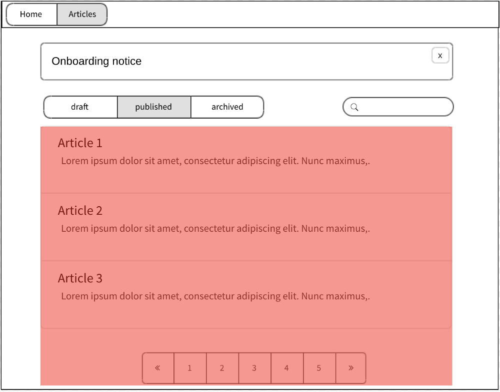
Let’s see an example with a new UI of a blog product to implement in our React application (top-menu excluded).
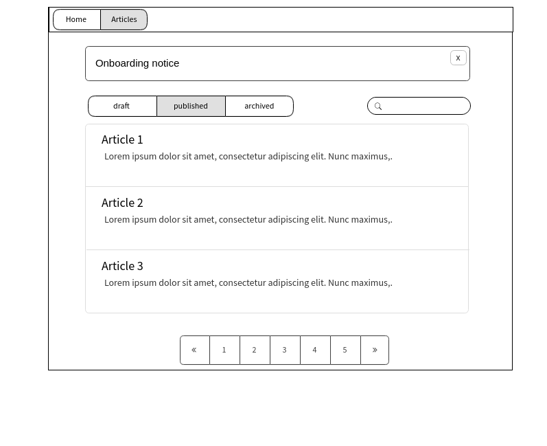
A new tab UI to implement
Following our “Decomposition patterns,” we could define the first draft with the following components:
- <ArticlesTab />:
top component (not outlined) - <OnboardingNotice />
- <ArticleTypeFilters />
- <ArticleSearch />
- <ArticlesList />
Articles container (not outlined) - <Article />
Article item - <ArticlesListPagination />
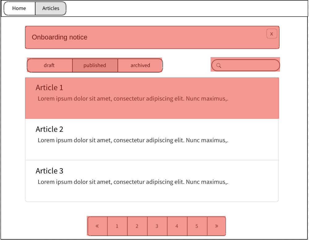
The filtering here introduces a good example of state decomposition:
first: <ArticlesTabs />, second: <Articles />
- <ArticlesTab /> will handle the state of the current search and current selected articleType
- We will need a new component (<Articles />), not linked to the UI, that will handle the state (pagination, querying data) for a given search and articleType
(<ArticlesListPagination> could also be moved inside _<ArticlesList>_ ) - Finally, <OnboardingNotice /> will handle its state independently using persistent storage (ex:localStorage) to determine whenever or not it should display a notice
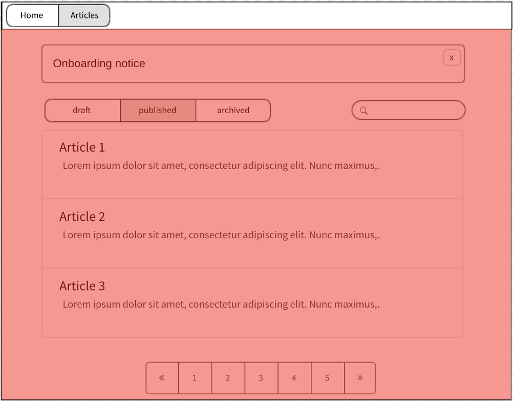
This given meeting point of the simplest state and UI purpose results in the following component structure:
Overview of components structure with states:
1<ArticlesTabs>
2    {/* state: type + search */}
3    <OnboardingNotice />
4    <ArticleTypeFilters />
5    <ArticleSearch />
6    <Articles type={} search={}>
7        {/* state: data + pagination */}
8        <Article article={} />
9        <ArticlesListPagination onSelect={} />
10    </Articles>
11</ArticlesTabs>
Conclusion
Decomposition patterns and the UI provided by your Product Designer are a good starting point to build well-defined components.
Then, confronting this UI-decomposition with the needed state and data will — most of the time — naturally shape the proper component’s structure as long as you keep simplicity in mind (not the smallest).
Then, confronting this UI-decomposition with the needed state and data will — most of the time — naturally shape the proper component’s structure as long as you keep simplicity in mind (not the smallest).
NB: How do we know if a component state is “simple enough”?
A good way to figure out is to — try to — test it! (see the Part III of this Series)
4. Enable React warning and keep your dependencies up-to-date
Here are some tips in order to truly embrace change in your React application.
React Strict Mode
React Strict Mode, when set up in your application, will allow you to foresee breaking changes in the upcoming React version that will impact your application.
The following warnings are offered by Strict Mode:
The following warnings are offered by Strict Mode:
- Identifying components with unsafe lifecycles
- Warning about legacy string ref API usage
- Warning about deprecated findDOMNode usage
- Detecting unexpected side effects
- Detecting legacy context API
This is especially helpful to ensure that your team will be able to migrate to a newer version of React.
Update your dependencies, as often as possible
Even without Strict Mode, React will emit warnings for deprecated API usage; this is a common practice in open source libraries.
For this reason, updating your application dependencies to latest patch or minor version as often as possible is an excellent practice to foresee which part of your application needs more attention.
A well-known tool — now free for Github users — is Dependabot.
You may think that updating often your dependencies is a frequent loss of time; however, a study proved the contrary.
streamlining refactors is more efficient that rebuilding from scratch or doing nothing
We all know projects where a “code freeze” of multiple weeks was necessary to update dependencies, or even worse, updating was no longer possible.
Conclusion
- Custom hooks are an excellent alternative to the Container/View pattern, let your component focus on UI aspects.
- Ensure your component relies directly only on data that is displayed; otherwise, use a business logic helper, custom hooks.
- Beware of bad abstractions; they are the most likely to prevent change.
- Decomposition patterns and the UI provided by your Product Designer are a good starting point to build well-defined components


We use cookies to collect statistics through Google Analytics.